
This is what every Web Developer Sees on a Webpage
(A Web Developers Vision)


What do you see when you open a website?
Now, I know there are several elements on the webpage that are competing for your attention, and which are also parts of a whole sequence of a smart and neatly done visual design aesthetics by the collaborative effort of designers and developers, providing you with the best user experience with a sprinkle of intuitiveness on top.
But is that all you really see?
Beneath the depths of the badass SVG morphing, perfect grids and alignments, slick gesture motions, mouth dropping 3d effects and animations, wicked carousels and what not, there is a fine little container that just sits there and makes everything seamless, like they were always meant to be!
Question: What should you actually see?
Should you see Divs, more divs, even more divs, or selectors, oh wait! I know, maybe ughhh, I think I lost it...
Well, all you need to see is what you've always known, and used, re-used, and still using. What I am trying to say is that they are the solid 4 sided objects perfectly shaped into a rectangular form called the BOX!
Introducing...
THE CSS BOX MODEL
If you're like me, and you can't do without using a computer daily, then I think you should have also seen more boxes in your life than you planned for, agreed?
Okay, so What is the CSS BOX MODEL? The term CSS BOX MODEL is used especially when referring to visual design and layouts.
The CSS BOX MODEL is just a fancy way of referring to each element on the web page as a box in CSS. It is essentially just a container for every HTML elements on a webpage.
And its individual components listed in descending order are:
- margin
- border
- padding
- content.
The Image below illustrates the standard and very detailed view (components) of the CSS BOX MODEL
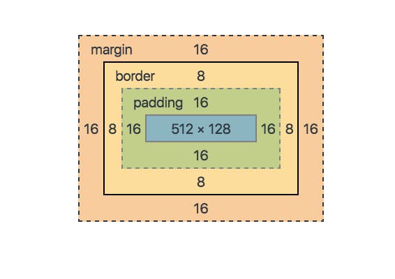 Image Credits: vikingcodeschool.com
Thinking Inside the Box
As you might have noticed that having a visual reference helps to form a pattern in your head and is also fundamental in familiarizing with this concept. From the image you can see that there are a bunch of rectangles nested within each other, with each having its own unique importance in the overall model. If you ever inspect a webpage with google chrome browser you should have seen this a couple times.
So, technically a single element on a web page is just a collection of rectangular boxes!
Let's see a break down:
- Content: This is the main content of the box (first layer), the part you really see, containing the images, text etc.
- Padding: This is the second layer from inside the box, closest to the innermost box (content), and it is also the area around the content.
- Border: This is the third layer from inside the box, and it is just like a fence around a house or farm field, containing the first two layers of the box model.
- Margin: This is the fourth layer, and it defines the space between the particular element in relation to another element on the page flow. If you have heard such a thing has someone is marking their territory that is the same thing has margin, it is like setting or claiming those boundaries.
The good thing is that, all this major components can be manipulated with and in CSS, and they all have some similarities, for example they are all 4 sided, this means that you can choose to interfere with just a particular side of the box by means of changing the values of the corresponding box layer you're in, or you could alternatively alter the entire perimeter around the box with a single value.
Use Cases
In order to play with dimensions and positioning you need to have a solid understanding of the box model in CSS.
Here is the calculation:
320px (width)
+ 20px (left + right padding)
+ 10px (left + right border)
+ 0px (left + right margin)
= 350px
The total width of an element should be calculated like this:
Total element width = width + left padding + right padding + left border + right border + left margin + right margin
The total height of an element should be calculated like this:
Total element height = height + top padding + bottom padding + top border + bottom border + top margin + bottom margin
Conclusion
In conclusion, as you journey to becoming a web developer, you will appreciate the knowledge of the CSS BOX MODEL everyday. If you master this concept now, you will become a PRO much quicker than you ever imagined.
"Think outside the box!"
Extra Resources
I recommend these extra resources to get a solid understanding on this topic
Feel free to engage in sharing and recommending to your friends, like and comment your thoughts in the box below, and please let me know if I missed out on anything or maybe you have an additional information that will help others learn better.